
ML Internals
Interactive Machine Learning Visualizer
Five algorithms you can step through one operation at a time, watching the state change and reading what changed it. Built for the gap between the formula and the output, which is where the people deciding whether to trust a model actually get lost.
- Format
- Engineering case study
- Language
- TypeScript
- Framework
- React
- Rendering
- Canvas
The problem
The middle is where the understanding is
Most explanations of an algorithm show two things: the formula, and the result. K-Means gets an objective function and a picture of coloured clusters. Backpropagation gets a chain-rule derivation and a loss curve going down.
What sits between them is the part that is actually hard. How does one iteration change the state? What does raising the learning rate do to the path, not to the equation? Why does this split get chosen over that one? A static explanation cannot answer those, because the answers are motion.
That gap is a product problem before it is a teaching problem. Deciding whether a model belongs in a workflow means reasoning about how it behaves, and most people are asked to do that from a formula and a number. This is an attempt at the alternative: make the behaviour inspectable, and let the reader form their own view of it.
Engineering brief
- Architecture
- Next.js and React in TypeScript, with each algorithm implemented directly rather than wrapped around a library, because the product needs the intermediate state a library treats as private. Controls, log and explainer are shared components; the five visualizations are dynamically imported and client-only.
- The hard part
- Every algorithm is its own state machine, and each one has to be steppable: one operation produces one visible change and one log line. That constraint decides the data structures, not the drawing code.
- Rendering
- Canvas rather than a chart library. These are per-frame states rather than plotted series, and drawing directly keeps the animation loop and the algorithm state in step.
- Known limitation
- The drawn state is unavailable to a screen reader. The text logs carry some of it, but this needs real work. The datasets are also small by design, which keeps them legible and hides the failure modes that make these algorithms interesting.
The approach
One loop, five algorithms
The whole product is a single interaction loop, applied to different algorithms:
- 01
Choose
- 02
Adjust
- 03
Step or play
- 04
Inspect
- 05
Read
Designing for inspection
Implementation decisions
Step exists alongside play
Autoplay shows the shape of a process. Stepping is what connects one operation to one visible change, so Step is a first-class control and is disabled while playing rather than fighting it.
The log narrates what the canvas shows
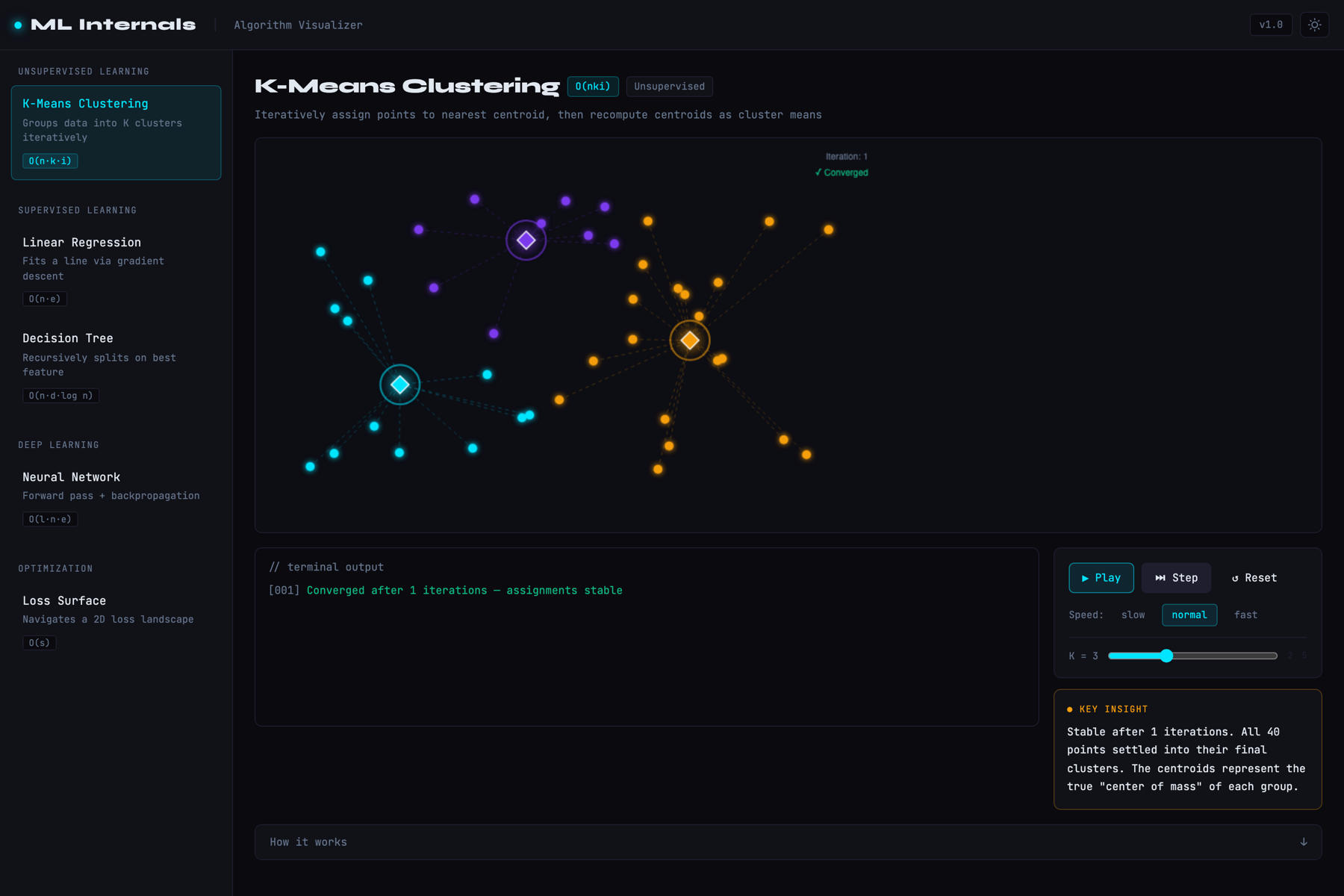
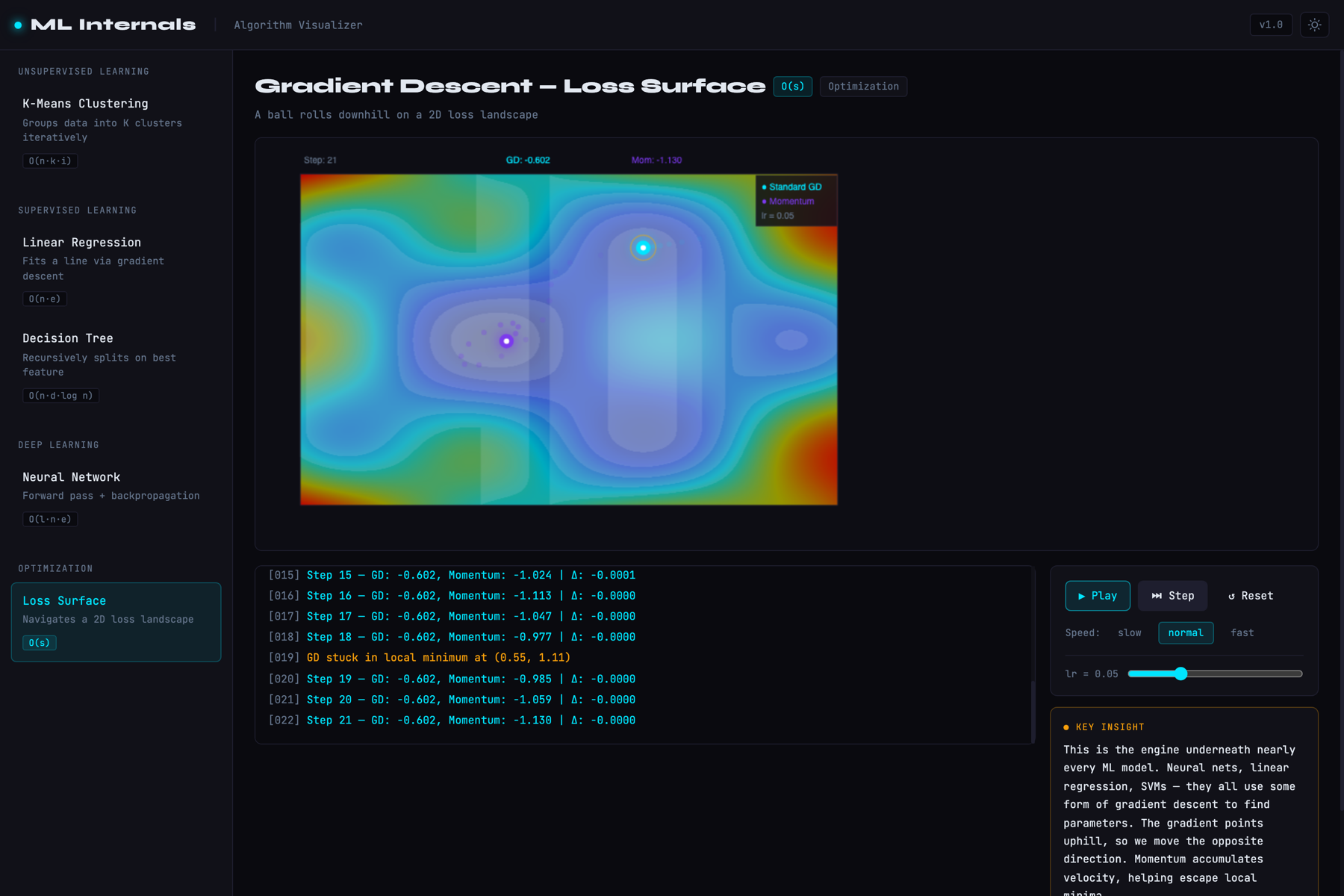
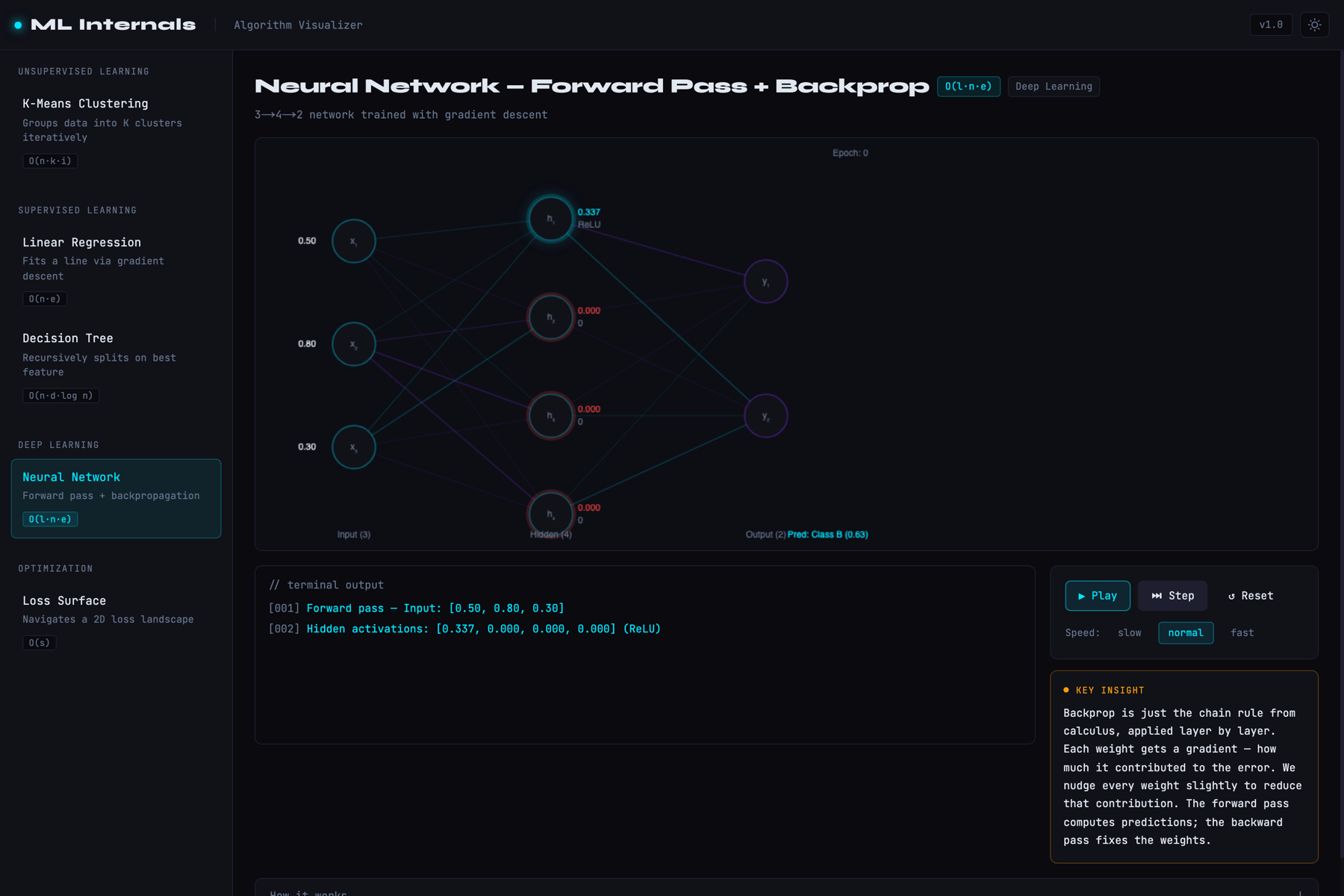
Animation shows that something moved. The terminal log says what it was: which activations fired, which split won, that the descent is stuck at a specific coordinate. Together they answer both what happened and why.
Two levels of explanation
A short insight panel sits beside the visualization for the state on screen right now. A longer explainer waits below the fold. Someone watching centroids move should not have to scroll past theory to keep watching.
One interaction grammar, per-algorithm controls
Play, step, reset and speed mean the same thing everywhere. Only the parameter changes: k for clustering, learning rate for descent. Learning the controls once is the point.
Canvas rather than a chart library
These are per-frame states rather than plotted series, so the visualizations are drawn directly. It also keeps the animation loop and the algorithm state in step.
Each visualization loads on demand
All five are dynamically imported and client-rendered, so opening the app does not pay the cost of four experiences nobody asked for yet.
The five
Different algorithms, different mental models
Each visualization is built around whatever is genuinely hard to picture about that algorithm, rather than running the same template five times.
- K-Means ClusteringUnsupervised
- Points reassign to the nearest centroid, then centroids move to the mean of what they caught. Convergence is visible as the moment nothing reassigns. The k slider is the argument for interaction: change it and the same data splits a different way.
- Linear RegressionSupervised
- The fitted line moves as parameters update and loss falls. Gradient descent stops being an equation and becomes a line sliding toward the data.
- Decision TreeSupervised
- Candidate splits are evaluated by Gini impurity before and after, and the winning split carves the space into regions. Greedy selection is easier to see than to describe.
- Neural NetworkDeep learning
- A 3→4→2 network shows activations per neuron on the forward pass, then error flowing backward through weights. The two phases are separated so they read as distinct operations.
- Loss SurfaceOptimization
- Standard gradient descent and momentum descend the same 2D landscape side by side, with the learning rate exposed. One gets stuck; the other carries velocity through.
Limits
Tradeoffs
- Clarity over scale
- Forty points, a four-neuron hidden layer, a 2D surface. Real datasets would be more honest and would show nothing legible at this size.
- Simplified cases hide edge cases
- Well-separated clusters converge cleanly. Overlapping ones, poor initialisation, and the failures that make these algorithms interesting are mostly out of frame.
- Canvas is weak ground for accessibility
- The drawn state is unavailable to a screen reader. The logs help, since they are text, but this needs real work rather than a note.
- The explanations can still lose a beginner
- Cross-entropy and Gini impurity appear by name. The layering softens it, but the floor is not zero.
- Five experiences, five maintenance surfaces
- Each has its own state machine and drawing code. Shared controls hold the interaction grammar together; the internals do not share much.
- It does not measure understanding
- The product makes mechanics inspectable. Whether anyone comes away understanding them is unmeasured, and would need actual study rather than assertion.
Next
What I would validate next
- Can someone predict the next step before pressing it? That is the test of whether the model in their head matches the one on screen.
- Which explanation level gets read: the panel beside the canvas, the explainer below, or neither?
- Do the logs clarify the animation or compete with it for attention?
- Which controls are found without being told? Speed and reset are probably discoverable. Step may not be.
- Where do mobile users lose the thread once the canvas and controls stop sharing a screen?
- Would a small challenge, such as predicting where a centroid lands, do more than free exploration?
- What is the non-visual equivalent of a canvas here, and is a described state enough?
How it is built
Implementation
Next.js 16 and React 19 in TypeScript, with the visualizations drawn on HTML canvas. Every algorithm is implemented directly in TypeScript rather than wrapped around an ML library, because the product needs the intermediate state, which a library would treat as an internal detail.
Controls, terminal log, insight panel and explainer are shared components, so the interaction grammar is defined once. The five visualizations are dynamically imported and client-only. Light and dark themes, and a drawer-based sidebar so algorithm selection survives on small screens.